When shopping for clothes, do you find you’re drawn to certain colours and avoid others? You may love the style of a particular dress, for example, but decide it’s not really your colour. Whether something is ‘your colour’ or not is more than just a gut feeling. As Chums fashion buyer Philippa Brooks explains, “not only do you need to choose colours that match each other, but also colours that flatter your skin tone and hair colour."
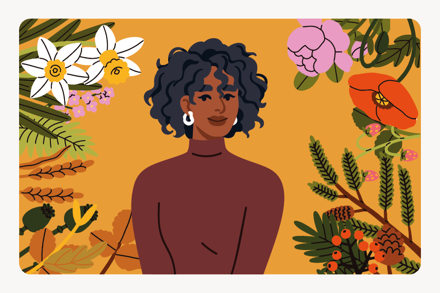
Colour analysis can help with this. It’s a process that identifies which colours naturally suit you, based on features like your skin tone, hair and eye colour. There are a few systems out there, but one of the most popular is seasonal colour analysis. This uses the Munsell colour theory – a system that breaks colour into three key dimensions: hue (warm or cool), value (light or dark) and chroma (muted or bright).
These three qualities combine to create 12 colour groupings, known as the seasonal colour types. Each ‘season’ represents a colour palette that harmonises best with your natural colouring.
So, how did seasonal colour analysis come about and why has it stood the test of time? Keep reading to discover the roots of this fascinating theory and how you can find the colours that bring out your best.
Humans have long been fascinated by colour. The first known theory of colour was developed back in Ancient Greece by Aristotle (384BC-322BC) who theorised that colours came from mixtures of lightness and darkness. Around 2000 years later, Goethe produced the first study on the physiological effect of colour in Theory of Colours (1810), arguing that the perception of colour is shaped by individual experiences and emotions.
It wasn’t until the mid-20th century that colour analysis became popular in fashion and personal styling. One early pioneer was Suzanne Caygill, a Hollywood stylist and designer who began developing her own system of colour typing in the 1940s. She noticed a relationship between a person’s natural colouring (hair, skin and eyes) and certain colour palettes. In 1980, she published her book 'Color: The Essence of You', which grouped people into seasonal types with poetic sub-categories like ‘golden spring’ and ‘tawny autumn’.
Another pioneer of colour analysis was Carole Jackson who had trained under Geraldine Pinkney, a student of Suzanne Caygill. In the 1980s, Jackson released 'Colour Me Beautiful', a more practical version of Caygill’s method with a clear guide on how to identify your seasonal palette and examples of the best colours to wear for each season type. Her book was a bestseller, selling over 13 million copies and sparking a global interest in personal colour palettes.
Following the book’s success, the Colour Me Beautiful brand expanded internationally, establishing itself as a leader in personal styling and image consultancy. The business began offering professional training, consultations and product ranges tailored to seasonal palettes.
In 1995, Jackson’s successors Mary Spillane and Christine Sherlock published 'Colour Me Beautiful’s Looking Your Best: Colour, Makeup, and Style' which introduced the 12-season system. This system breaks the seasons into three subcategories, made up of two of Munsell’s colour dimensions, one dominant and one secondary:
In the years that followed, colour analysis continued to evolve, with some consultants now using even more refined classifications. For example, the 16-season system was developed in the early 2000s, which introduced neutral categories for those whose undertones aren’t necessarily warm or cool. This ongoing evolution highlights the value of colour analysis in practical terms. As Philippa Brooks puts it, “Colour analysis empowers shoppers. When someone has a strong understanding of their season or dominant colour characteristics, it makes their shopping experience easier.”
Identifying your colour palette isn’t always easy. With so many shades and tones to choose from, it can feel overwhelming to figure out where to start, especially when trends, personal preferences and practical wardrobe choices all come into play.
For example, while most colour analysis systems apply to both men and women, men may feel it’s less relevant for them. Generally speaking, men tend to opt for more neutral colours in their clothing than women. However, Philippa Brooks explains that “by emphasising on neutral colours as a base, it enables men to elevate their outfits through incorporating an accent colour. This is why, even for men, understanding your seasonal or tonal colours is a great help.”
To help you understand your seasonal colour, here at Chums we’ve created a free downloadable e-book. This practical guide will help you understand colour theory and discover your own personal palette so next time you go out to buy some new trousers, you know exactly which shade to go for.

If you’re interested in seeing which seasonal colour palette you have, there are several ways to do this, including:
Beyond helping you look your best; colour can have a powerful impact on how you feel and how others respond to you. This idea, known as colour psychology, explores the emotional and psychological effects different colours can have. When designing branding or commercial spaces, colour is usually carefully considered, taking into account its effects on emotions and behaviour.
Take red, for instance. It’s bold, attention-grabbing and often associated with passion and energy, which is why it’s so widely used around Valentine’s Day. However, it can also signal danger or urgency, making it a less ideal choice in settings like hospitals where it may also be associated with blood.
Green, by contrast, is linked with nature, calm and renewal, making it a go-to for health and eco-conscious brands. Similarly, blue is a soothing colour that can create a more relaxed atmosphere. That being said, as blue food is uncommon, the colour can suppress appetites, so it’s rarely used in restaurants or food packaging.
Yellow is often used for signs with warnings or alerts as it’s an attention-grabbing colour. While it’s associated with energy, warmth and fun, it can be overstimulating if overused, especially in spaces meant to feel calm.
When you understand the emotional resonance of each colour, it becomes easier to dress intentionally. Want to feel more confident at a social gathering? Try a bold red. Or, need to lift your spirits on a grey winter morning? A pop of yellow can brighten your mood. As Philippa Brooks outlines, “some colours can non-verbally influence or communicate emotions. Understanding this silent language enables you to shape perceptions and influence how others engage with you intentionally.”
Ultimately, the colours you wear do more than just complement your outfit – they interact with your natural features and even influence how you feel and how others perceive you. Understanding the principles of colour analysis and the psychology behind colours can help you choose shades that make you truly pop.
Have you ever tried colour analysis tools? Let us know by sharing your thoughts on social media using #ColourConundrum.

See our privacy policy to understand how we process your data to send you marketing emails
Copyright © 2026 Chums